Hi, I’m jenifer John Riginous. A designer focused on creating accessible and inclusive user experiences — always observing the details around me.
Currently studying Systems Design Engineering @ the University of Waterloo.
Previously UX @ Questrade
Linkedin Email Github
Hi, I’m jenifer John Riginous. A designer focused on creating accessible and inclusive user experiences.
Currently studying Systems Design Engineering @ the University of Waterloo.
Please switch to desktop to view my full portfolio! :)
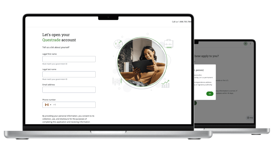
Streamlining the onboarding flows for Questrade Trading platform
est. 8 min read
Role
UX Designer - Intern
Team
1 Product Manager
3 UX Designers
2 UI Designers
Investors face challenges navigating Questrade's online account opening (OAA) process due to unclear information, complex financial concepts, and usability issues. High drop-off rates on key pages indicate gaps in user understanding and alignment with expectations, leading to frustration and incomplete applications.
Problem
This study builds upon a previous research study to verify the initial concept of the onboarding process. It aims to understand the reasoning behind some of the pages that have high dropout rates and potential usability issues.
Two main focus areas:
Identifying pain points for investors as they create an investing account using the Web OAA flow.
Understanding why users drop off at certain screens.
Objective
At Questrade, we conducted research through prehistoric Google Analytics data from the previous quarter, we noticed that users drop off rates were significantly higher on various pages.
Research

Pages with high drop off rates:
Testing
We conducted 8 moderated interviews aimed at our primary and secondary users.
Key Findings:
Overall participants are moderately satisfied with their experience opening an account, but there is still room for improvement.


Learn more option added for more information
Offers additional details and a link to in-depth resources, ensuring users can explore further if needed.
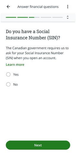
Reworded for improved clarity
Simplifies the question and provides clear context, ensuring users can respond with confidence.
Simplified language with added 'Learn More'
Made the text approachable and included a 'Learn More' button to provide clarity and additional support for users.

Design Decisions


Simplified language with added 'Learn More'
Made the text approachable and included a 'Learn More' button to provide clarity and additional support for users.
Reflection
Learning the Corporate Design Process: This experience taught me how to balance user needs with business goals while collaborating with different teams.
The Value of Iteration: I learned how to take feedback, refine my designs, and improve the user experience through an iterative process.
Full Prototype